Tasmania State
Service Careers
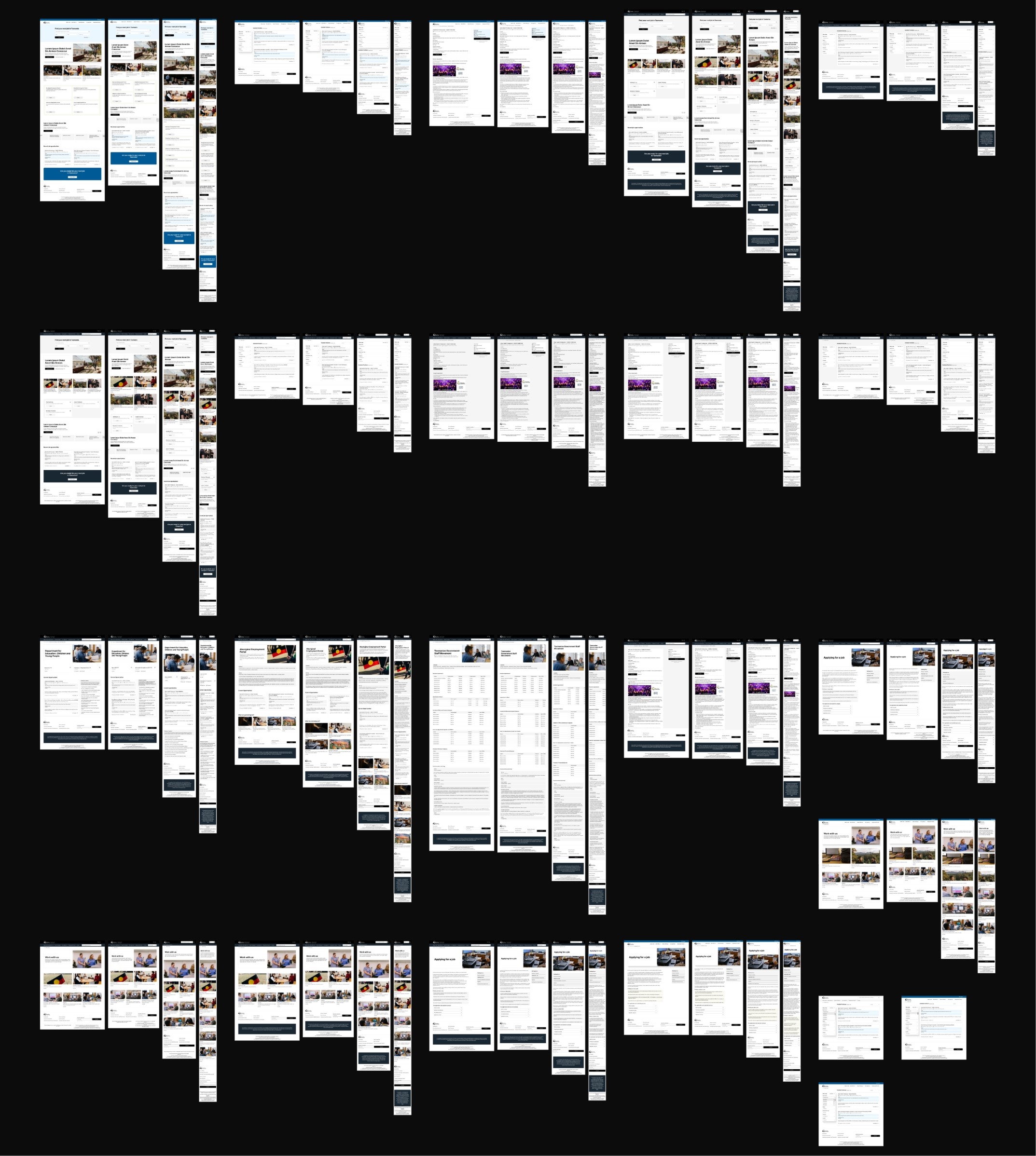
A government job platform serving the entire state of Tasmania — redesigned end to end, from research to handover-ready design system, in under a month. Over 100 screens across four breakpoints. A simplified but robust design system built live alongside the UI, ready for a government development team to implement without a designer in the room.
The department pushed it live. The improvement in usability and experience was immediate and visible. During wireframes, the feedback from the client team was consistent: "Looking fabulous — everyone has commented on how nice it feels." For a government project with strict visual guidelines that kind of response at wireframe stage means the process worked.
Services Provided
UI/UX
Web Design
Design System

The Challenge
Tasmanian State Service Careers is the centralised platform for all government job listings across Tasmania — essentially a state-wide version of Seek, built for public sector recruitment. The client wanted a full redesign of the job-seeking experience.
The timeframe was a month. Research, wireframes, design, and a complete design system — four phases that would normally be spread across a quarter, compressed into four weeks. That constraint shaped every decision about how the project would run: what to prioritise, what to defer, and how to move fast without losing rigour.
UX Research
The research phase ran in two tracks simultaneously.
User research began with data provided by the government team — who the platform's users were, what they needed, and what was frustrating them. That input was structured into a Jobs to Be Done framework, mapped across five dimensions: JTBD, Pains, Gains, Current Solution, and Gaps. The Gaps column was the most important output — it identified where the platform was failing users in ways that were fixable, without requiring features that would be expensive to build and impossible to validate in the available timeframe.
With no budget for A/B testing, the approach was deliberate: focus on guaranteed wins. Potential features were documented for future consideration, but the design scope was anchored to improvements with clear, defensible user value. User stories were written for each identified user group, and a simplified user path was mapped to identify the pages that mattered most.


Industry Research
Industry research ran alongside user research. Every other Australian state careers platform was reviewed, along with the most widely used job platforms nationally. Ten competitors were plotted on an industry map using two axes — Usability & Accessibility on one, Feature Richness on the other. The map gave a structured picture of where the current standards sat, where the gaps were, and where TSS Careers had the clearest opportunity to differentiate.
Microsoft Clarity data from the existing platform supplemented both tracks — session recordings and heatmaps surfaced specific frustrations: where users dropped off, what they clicked that didn't respond the way they expected, where the experience broke down in practice rather than in theory.


Wireframes & Information Architecture
Six core pages were identified as the primary wireframe focus — the pages that sat on the most common user path and would deliver the most impact if resolved well.
Three rounds of wireframes followed. Each round was structured to lock in three things: functional logic, flow logic, and implementation cost. The third dimension mattered as much as the first two. Government projects have fixed budgets and fixed timelines on the development side; a wireframe that proposes something technically expensive creates a problem that surfaces months later. Every proposed solution was weighed against what it would realistically cost to build.
One of the more complex problems was job description formatting. Every government agency uses its own internal template. The wireframes had to propose a structure that could either unify those formats or accommodate them — without breaking the visual coherence of the platform or requiring every agency to change their internal processes. That took more rounds of conversation than the wireframes themselves.
Information architecture was developed in parallel, mapping the logic of page flow so the navigation made sense to a user arriving from any entry point, not just the homepage.

UI Design
The visual design phase moved quickly. Tasmania's government has strict brand guidelines governing how digital products are represented — which meant the design decisions with the highest impact were spacing, hierarchy, and visual clarity rather than colour or typography exploration. That constraint, applied well, produced a cleaner result faster.
Direction was approved really fast. Final design covered 30+ pages across four screen sizes — desktop, tablet, and two mobile breakpoints. Combined, the total screen count exceeded 100.
Design System
The design system was built live inside the design file rather than as a separate phase. The approach was a simplified system built on two layers:
Primitives — the fixed values: colours, font weights, typeface, letter spacing.
Responsive tokens — values that adapted across the three breakpoints automatically: font size and line height, spacing, and border radius. Approximately 60 tokens in total.
On top of those foundations, responsive components were built — buttons, dropdowns, accordions, input fields — and common UI blocks were assembled as drag-and-drop elements, allowing the government team to construct responsive layouts in Figma without needing a designer to intervene.
The handover file documented the full system: grid logic, colour and text style structure, component hierarchy and responsive behaviour, navigation logic, and CSS snapshots of hover states. Everything the development team needed to build from the file without ambiguity.
Next Case Study
Branding
Website
Graphic