Kings Digital
A Tasmanian digital agency walked away with something most businesses never fully achieve: a brand that works the same way at every level. From the door signage greeting clients before a meeting started, to the proposal document in their inbox afterwards — every touchpoint said the same thing, in the same voice, with the same confidence.
Proposal turnaround time halved. The marketing team were producing on-brand social content 70% faster using purpose-built Canva templates. Social presence went from near-zero to consistently active. A complete Figma ecosystem gave the whole agency a structural foundation for every project that followed.
2023-24
Services Provided
Branding
Web Design
Graphic Design
Animation
Design System
UI/UX
The Challenge
KingsDigital is one of Tasmania's leading digital agencies. You wouldn't have known that from the brand.
The existing identity had done its job for long enough. The company had moved on — in direction, in ambition, in the work it was chasing. The brand hadn't followed. No unified asset library, no social presence, nothing governing how the agency showed up from one client interaction to the next.
The sharpest symptom was the one that cost real money. Clients weren't confident they were looking at a creative agency before the meeting started. When your business is selling creative capability, that disconnect compounds — in pitch rooms, in first impressions, in every proposal that lands without the brand doing any of the heavy lifting.
The brief wasn't a refresh. It was a full rebuild — identity, infrastructure, and the internal systems to sustain both.
Brand Identity
Before any design decisions, the work started with understanding: why the old brand had failed, who the audience was now, what tone the business actually wanted to carry.
The logo carries that thinking. The letters K, I, N, G mirror their positions on a keyboard — a considered nod to the digital space the agency occupies, grounded in something real. Four primary colours mapped to the agency's core services gave the palette structural purpose. A 24-page brand guidelines document — developed in close collaboration with the directors — formalised the full system: logo usage, colour, typography, tone of voice, UVP, mission, vision.
A working document, not a shelf piece.


UI/UX Design & Web
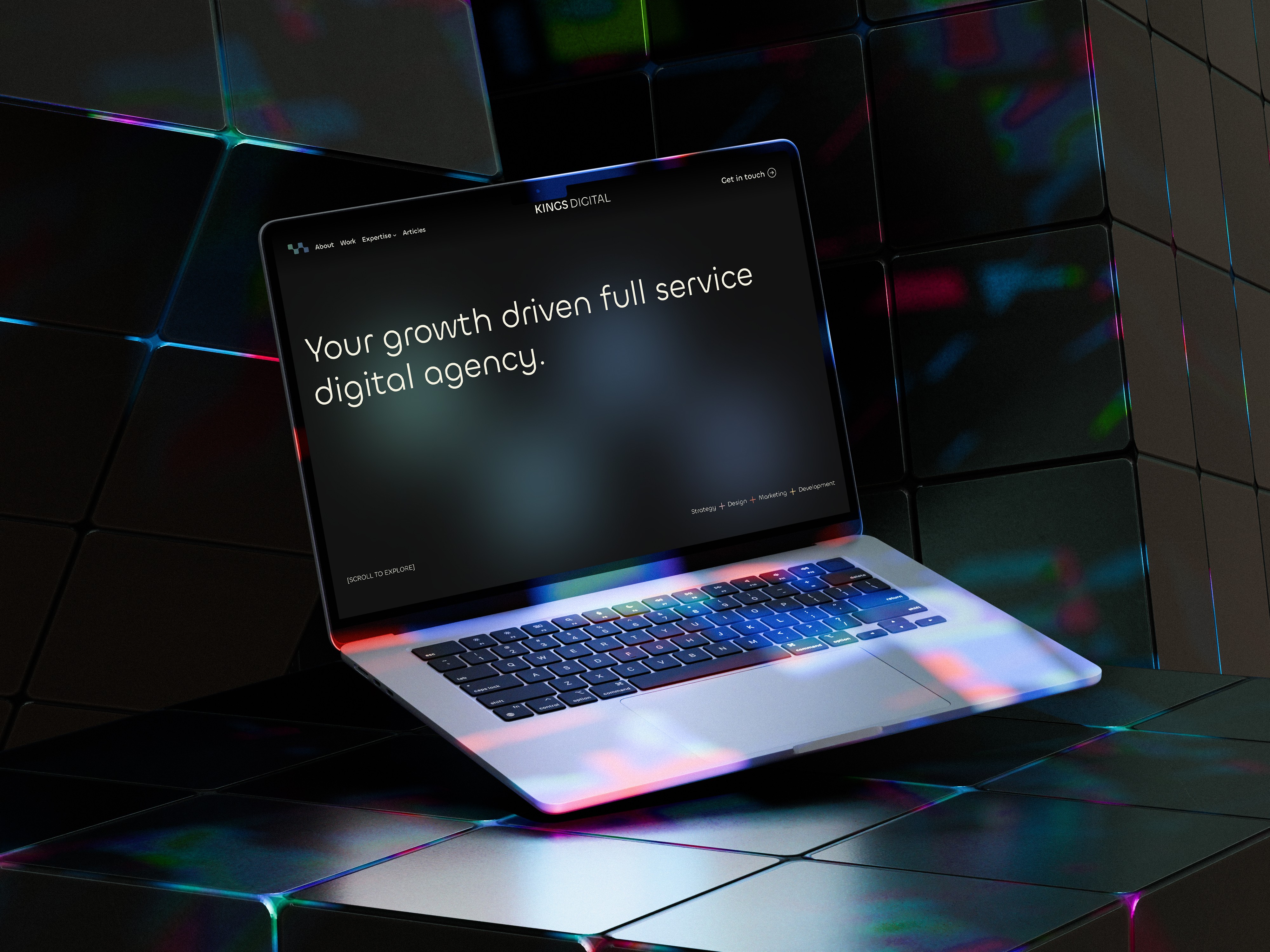
The website relaunch ran concurrently with the rebrand, under tight development timeframes. Built on WordPress as a fully custom implementation, the site was structured around how prospective clients actually navigate an agency website — information architecture first, visual layer built on top. Modern, and designed to evolve as the business did.
Graphic Design
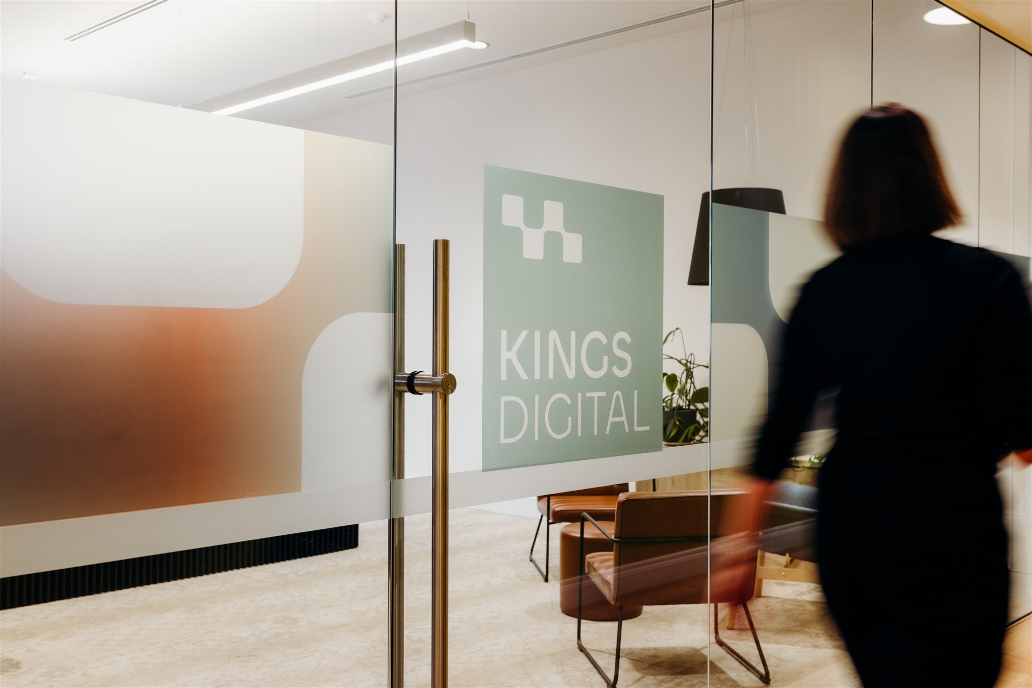
A brand that only lives in a guidelines document is half a brand. The identity was extended across the full footprint of the agency's daily life: proposals, contracts, invoices, email signatures, EDMs, banners, apparel, and office signage. Each touchpoint treated as a moment in one continuous experience. The door signage became a quiet proof of concept — clients walked into a physical environment that matched the digital one before a word was spoken. That changed the tone of every conversation that followed.

Social Design
Getting social from absent to consistently active required more than a style guide — it meant removing friction for the people responsible for posting. A Canva template system built for non-designers gave the marketing team the flexibility to cover different content types while keeping every output unmistakably on-brand. The result: 70% faster content production, no designer required in the loop.


Internal Systems & Figma Ecosystem
The layer with the longest shelf life was the infrastructure built to sustain everything else. A complete Figma ecosystem: custom design system, project and UX templates, proposal and report frameworks, branding workshop structures. Every file organised so any asset could be found in seconds. Proposals that had required building from scratch now took half the time. Handover on any project became clean and predictable. Training brought the wider team to independent proficiency — the system was built to be handed off.

Next Case Study
Branding
Website
Graphic