St Lukes
A three-year ongoing engagement followed - including the marketing function for their digital channels, a sister website, and a management portal. An organisation where most of business once lived outside of digital now converts the majority of it online.
Those results came from a research-led process, built under genuine constraint, run by a single designer.
2023-26
Services Provided
UI/UX
Web Design
Design System

The Challenge
St Lukes is an Australian health insurance provider. Their existing website was underserving both the business and its users - navigation was unclear, the path to purchase was unnecessarily complex, and the experience didn't hold up against the standard set by national competitors.
The structural challenge was bigger than the design one. Budget was tight. Timelines were compressed. The leadership team, as is common in large established organisations, was risk-averse by nature - and getting work approved through layered decision-making required as much rigour as producing it. Eighty percent of their business was happening offline. The website wasn't working as a front door, let alone a sales engine.
The brief was a complete rebuild: UX, UI, and a design system capable of sustaining the site long after launch, handed to a development team working on a headless CMS architecture.
Research & Analysis
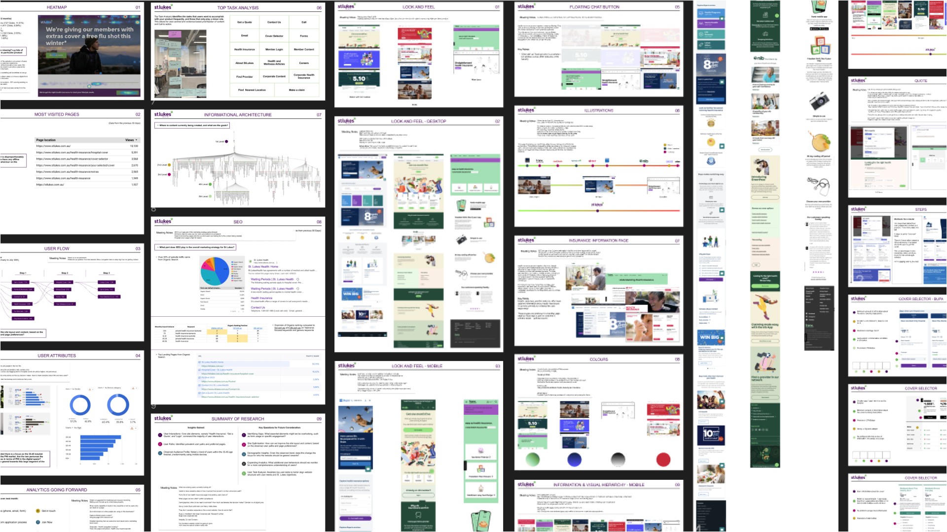
The process started where it should — with 12 months of existing heatmap and analytics data from the live website. User flows were mapped with drop-off percentages at each stage, identifying exactly where and why people were leaving. Rather than relying on assumptions, the research exposed specific friction points that the redesign could target directly.
Additional analytics instrumentation was added to the live site during this phase — plugging gaps in the data at points where the existing setup wasn't capturing what we needed. The insights being gathered informed the new solution as it was being designed.
User personas provided by the St Lukes team formed the starting point for audience definition, but the behavioural data told a more complete story. The target user segment was expanded beyond the initial personas based on what the analytics actually showed about who was using the site and how.
A competitive analysis reviewed every major Australian health insurance provider — mapping the standard of digital experience across the market, identifying where the gaps were, and establishing what "good" looked like in this category. A heuristic evaluation of the existing site followed: usability principles, information hierarchy, content clarity, missed jobs to be done, navigation logic. The audit produced a clear picture of what wasn't working, and why.
Wireframes & Architecture
With the research consolidated, a customer journey map defined the experience from the user's perspective — every touchpoint, decision point, and drop-off risk between arriving on the site and completing a purchase. That map became the reference point every subsequent design decision was tested against.
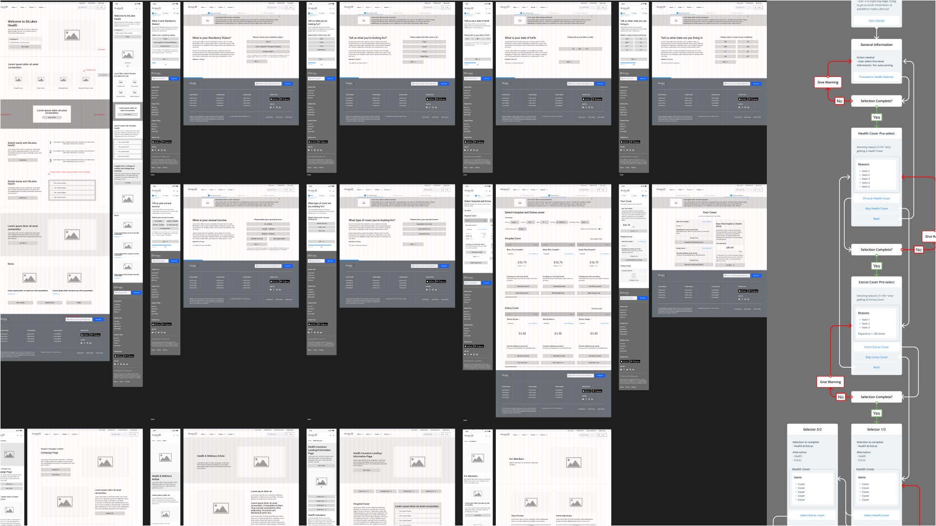
Over 100 wireframe pages were produced to resolve the experience flow before any visual design began. Functional logic, flow logic, and implementation cost were all locked in at this stage — the same structural discipline applied here as in any engagement where development budget is finite and post-launch changes are expensive.
The technical complexity of the project added a layer that most website redesigns don't carry. As a headless CMS solution, the decisions made during this phase — about content structure, page architecture, and the logic governing the cover comparison and extras selection tools — had direct implications for how the backend would be built. The wireframe stage included significant alignment work with the development team to make sure the UX vision and the technical stack were moving in the same direction.
UI Design & Design System
Design moved in parallel with development once the architecture was set — a deliberate sequencing decision given the timeline pressure. More resource went to development; design operated fast within tighter constraints.
Those constraints were real: brand guidelines limited visual exploration, stakeholder buy-in at each phase required preparation as much as craft, and the development timeline set a hard pace. The approach was to concentrate design effort on the primary user journey screens and a selection of marketing and content-heavy pages — enough to establish the full pattern library the development team needed to build the rest consistently.
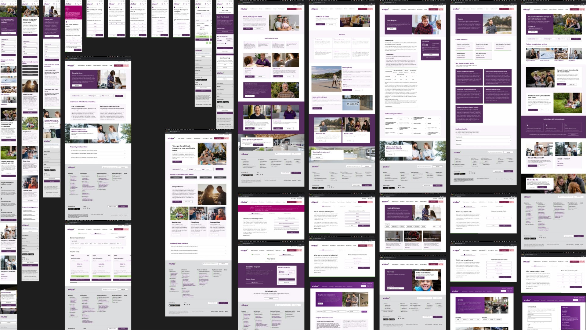
Over 200 screens were produced during the initial build phase. A UI system was built alongside them — unifying the design language, documenting component logic and responsive behaviour, and giving the development team the structure to extend the site without design input at every step.
Post-launch, the work continued. A/B testing produced findings that fed back into ongoing design uplifts. New campaigns were designed and rolled out. A sister website — Astute Health — was built and launched. A management portal was added. The design system that was established at launch made all of it faster.
Next Case Study
Branding
Website
Graphic