DMZ Karpaty
Every European investor and client who walked into DMZ-Karpaty's meetings came away convinced they were dealing with the largest freight wagon manufacturer in Ukraine. They weren't. The company wasn't the biggest. It wasn't the most productive. But it looked like it was — and in the world of industrial B2B, perception moves capital.
The wagon branding campaign became a new service line and revenue stream. The website won Ukraine's Website of the Year. A multi-year engagement followed, built on the trust that comes from delivering beyond the original brief.
2019-22
Services Provided
Branding
Web Design
Graphic Design
The Challenge
DMZ-Karpaty manufactures freight wagons, rolling stock, and metal constructions in western Ukraine. The ambition was clear: attract European investors and be perceived as the most modern company in the sector — despite not ranking in the top three by size.
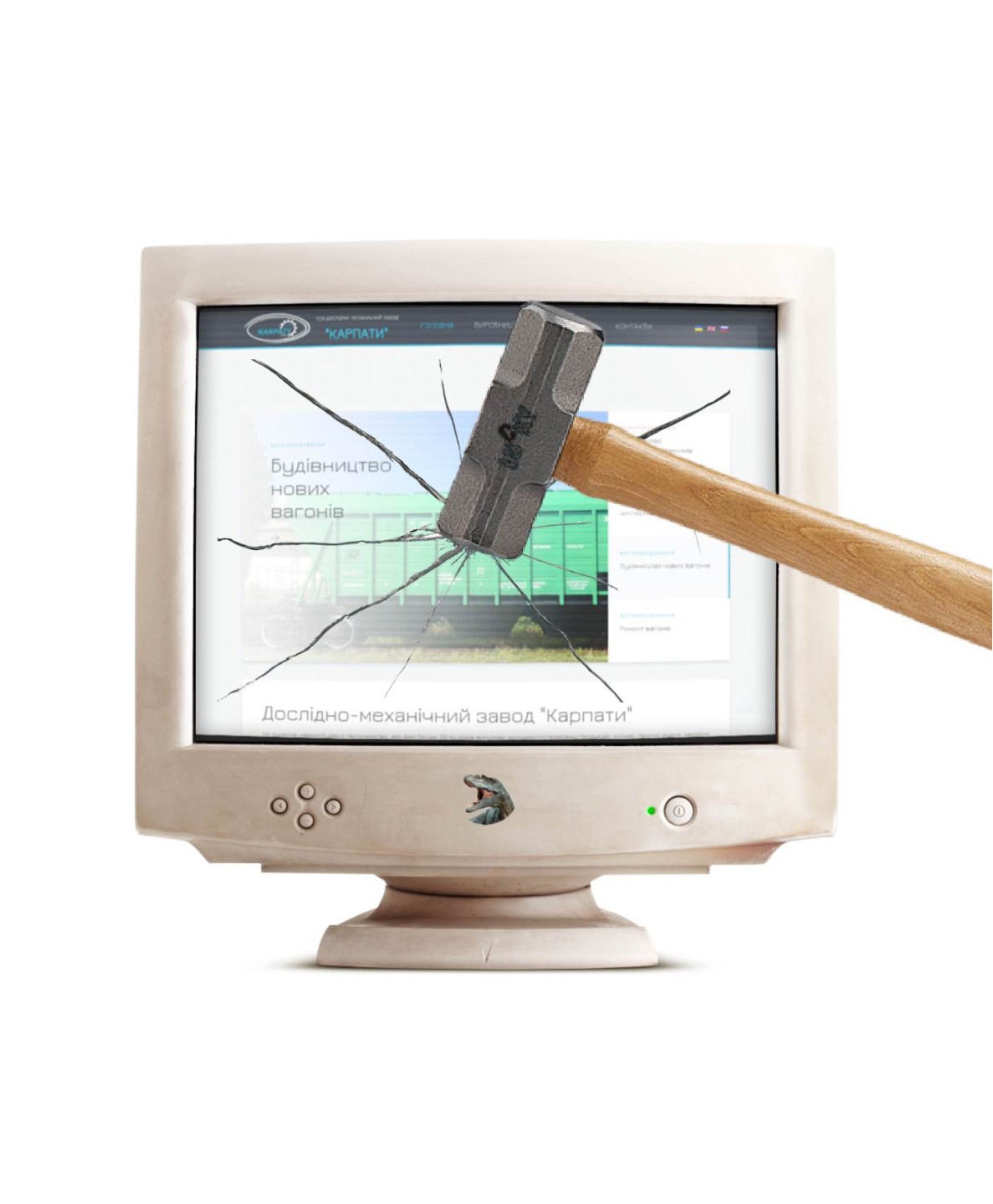
The brand didn't support that ambition. It carried what the industry called a "dinosaur" image — functionally capable, visually invisible, weighted down by the aesthetic inheritance of Soviet-era industrial design. Outdated, unmarketed, with nothing to distinguish it from competitors who looked exactly the same.
The opportunity was also clear: research showed that every competitor in the sector had the same underdeveloped brand and digital presence. Whoever moved first would define the standard.
Brand Identity
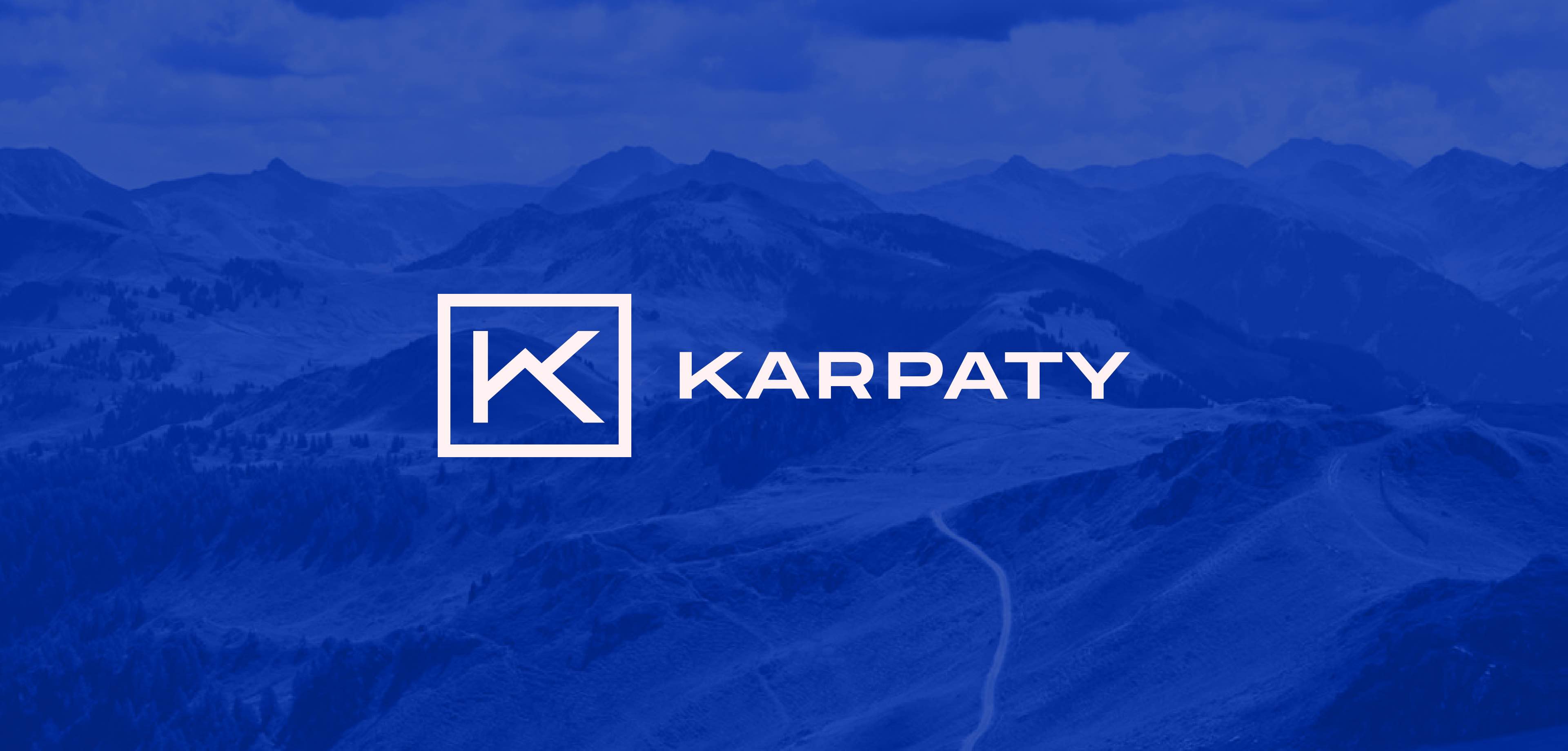
The rebrand started with a geographical anchor. The plant sits in the Carpathian Mountains — a distinctive, meaningful location that the old identity had completely ignored.
The logo was built from that. The letter K, drawn from "Karpaty," was shaped into a mountain silhouette — a mark that communicated both the company name and its regional roots without resorting to generic industrial iconography.
The colour palette was drawn from the same territory. Blue and yellow — echoing the Ukrainian flag, the sky and the wheat fields the country is known for. Green for the forested slopes of the Carpathians themselves. Colours that carried cultural resonance without needing explanation to a Ukrainian or European audience.
The identity was then applied across the full surface area of the business: apparel, gate design, business cards, catalogues, exhibition stands, books, signage, and every other touchpoint the company occupied. A 60-page product catalogue was produced for trade exhibitions. Every piece resolved to the same standard — a company that looked as capable and considered as it claimed to be.

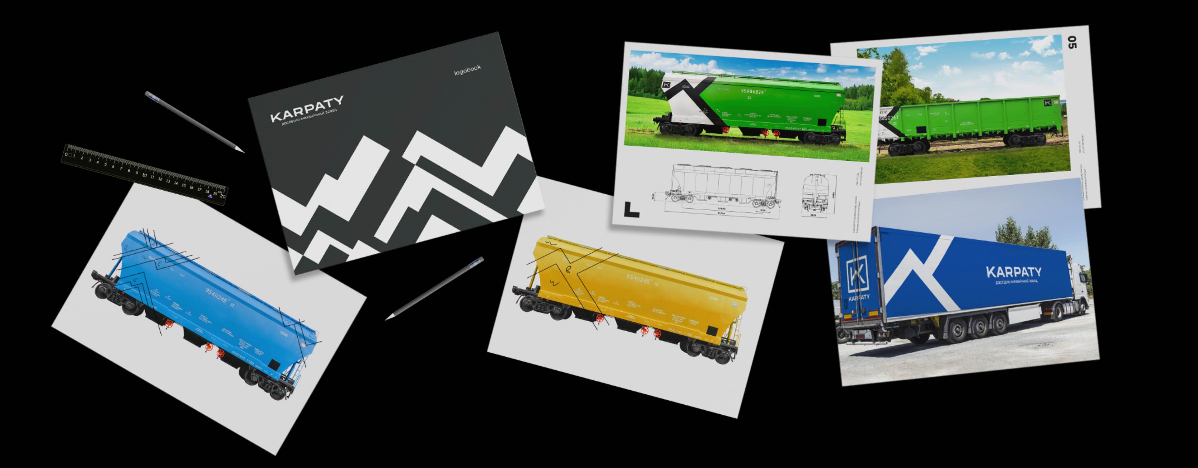
The Wagon Campaign
The most consequential decision on this project wasn't a design one. It was noticing an opportunity that wasn't in the brief.
Freight wagons in Ukraine are everywhere. They travel the entire country — through cities, across borders, through every region. And without exception, they are all the same: rusted, unbranded, invisible through sheer ubiquity. Nobody looks at them. They had become part of the background.
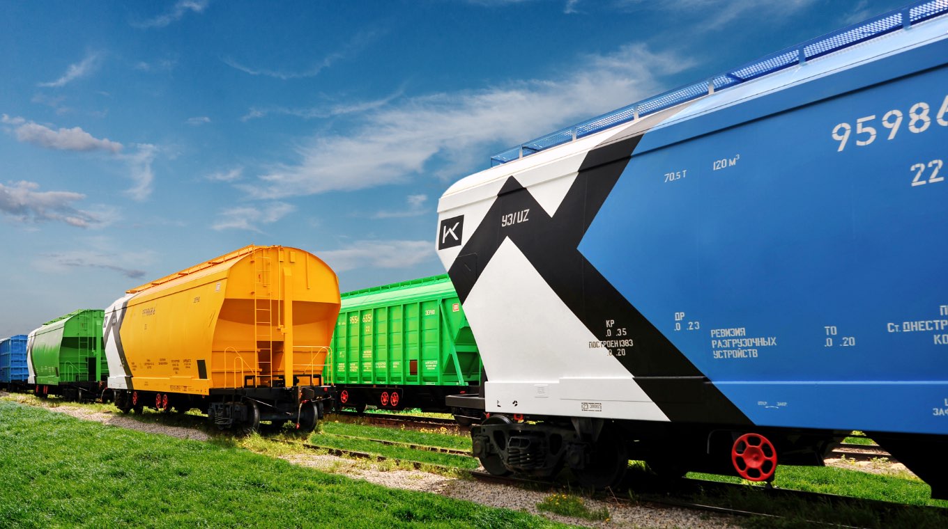
What everyone else saw as an operational asset, we saw as a moving canvas. A wagon branded in the new DMZ identity — blue, yellow, green, unmistakable — would travel to every corner of Ukraine and beyond. It would reach the exact audience the company was trying to attract, in the most direct way possible: live, physical, at scale, without media spend.
The first branded wagons went out. The difference was immediate. Against the industry backdrop, they were impossible to ignore. Working in Kyiv — hundreds of kilometres from the plant — we started seeing them on the tracks ourselves. So did everyone else.
What began as a brand visibility campaign became a product offering. DMZ-Karpaty started selling branded wagons as a service. A marketing initiative had created a new revenue stream.

Website Design
The existing website embodied exactly the image the company was leaving behind. The replacement was built from scratch: fully custom, designed with the complete brand system behind it, structured around how European investors and industrial buyers actually evaluate a supplier online.
The result won Ukraine's Website of the Year — recognition that validated both the design quality and the strategic repositioning it represented.

Website of the year award
Graphic Design
The engagement extended well beyond brand and digital. DMZ-Karpaty attended industry conventions and exhibitions, and every piece of material needed to hold up to the same standard as the rebrand — or the effort was wasted the moment someone picked up a badly designed brochure.
Planning, branding, and execution of exhibition stands, hand-out materials, the 60-page catalogue, business cards, calendars, and presentation documents were all within scope. The gate design for the plant itself was included — the physical environment shaped to reflect the same identity as every other surface.
Next Case Study

E-commerce
Website
UI/UX